ORDERS PLACED 12/18 OR AFTER MAY NOT ARRIVE BY CHRISTMAS
- ALL PRODUCTS
-
SHOP BY CATEGORY
-
SHOP BY VIBE
-
SHOP BY COLOR
-
SHOP BY SIZE
- CLEARANCE
ORDERS PLACED 12/18 OR AFTER MAY NOT ARRIVE BY CHRISTMAS
October 12, 2021

By now, I imagine it's safe to assume it's very old news to those in the tie dye community that Dharma Trading Co. has been in the process of reformulating dozens of dye shades for quite some time. Now that the colors requiring reformulation are (nearly all) complete and back in stock for the most part, fellow tie dyers may be wondering the same as I was: “How similar or different could they possibly be? Is there any notable difference in any shades — whether for better, or worse?”

I‘ve been itching to know myself — so I took the time to scratch that itch real good! I’ve tested out as many of the new, reformulated colors as possible (thus far) and now I’m finally ready to reveal all that I’ve discovered, albeit a bit late!

Since I have a good handful of the previous formula (which I’ll be referring to as the ‘OG’) dyes still floating around my collection from lot # batches that were created long before any word of reformulating colors ever came about, I couldn’t resist seizing the opportunity to compare those to their newly reformulated counterparts.
Today's blog will be sharing comparisons of the OG vs. the new reformulated dye colors I currently have in my collection. Although I don't have the OG version of every single color Dharma has revamped in recent months for a small handful, I'll still be sharing the swatches of the reformulated versions of those as well.
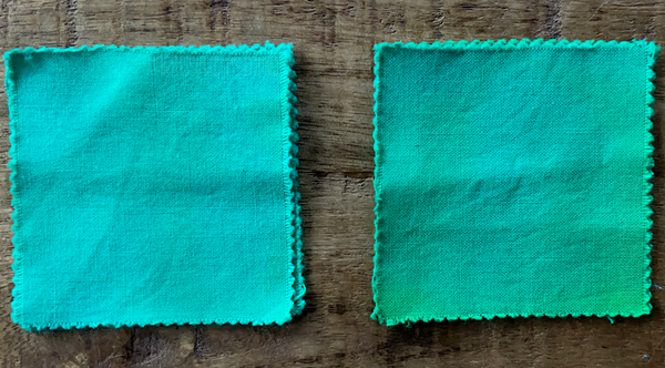
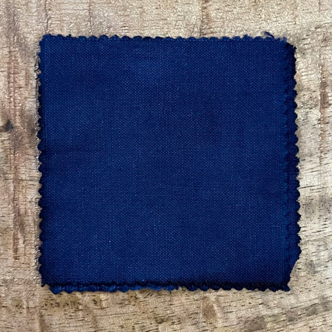
*The photos below all feature the OG version on the left and the reformulated version of the same color on the right. The few shades marked with an asterisk * indicate the image is of the OG version only, but will be updated as soon as I'm able to acquire the new, reformulated version. All samples pictured below are swatched on 100% cotton fabric squares, with each color mixed at the recommended dye-to-water ratio.
BLUEBIRD - Brand NEW color released in 2020!

BABY BLUE

BAHAMA BLUE *
CHARCOAL GRAY 
CHARTREUSE


ELECTRIC BLUE


GLACIER BLUE


GUNMETAL GRAY

KELLY GREEN 
MERMAID'S DREAM


MIST GRAY

 ROYAL BLUE


SAFARI GRAY *

SEAFOAM


SEAGLASS

TURQUOISE
 WISTERIA

ALPINE BLUE
BRILLIANT BLUE 
BLUEBERRY
CARIBBEAN BLUE
CERULEAN
GRECIAN SEA
KINGFISHER BLUE
LAPIS
NAVY BLUE
PEACOCK BLUE 
The main (and one of the only) aspects worthy of noting, in my opinion, is the difference in texture/consistency some of the new, reformulated dyes now embody. Colors such as Cerulean, Turquoise & Mermaids Dream now feature a much more chunky, yet sort of fluffy consistency. It reminds me somewhat of snow. Or, what we in the Midwest would call packing snow. But, unlike snow, one of the blue components seems susceptible to sort of hardening/solidifying, hence why "chunky" came to mind as an accurate adjective to use.
 On the other hand, some colors, like Seafoam, Baby Blue, Glacier Blue, Wasabi (and a few more that are slipping my mind atm, I’ll edit this to include once I recall) all feature a distinctly different texture than their past formulations. Imagine scooping a teaspoon of dry sand off the beach and pouring it out — that’s exactly how I’d describe the reformulated version of these colors: granular and very much reminiscent of sand.
Also, much like when you try to mix sand and water — the colors now featuring this texture seem to separate much faster once mixed with water than their previous versions. The extent of pigment separation and settling at the bottom of the bottle is especially apparent when dumping any leftover, expired dyes down the drain. Though settling is always much more apparent once a liquid dye is on the less-than-fresh side, as mentioned — it is notable just how quickly the pigment begins to separate compared to ever before. I find this is easily remedied by simply shaking my dye bottles extra well between uses, even if I've just mixed the colors fresh minutes before. Problem solved!
Despite that last paragraph outlining what might be perceived as a con or downside, I must say: I genuinely enjoy the new, reformulated versions of a few of these color much more. Notably Baby Blue & Glacier Blue - which both seem to produce nearly identical, yet somehow a more rich, opaque color than their OG formulations.

Except for Seafoam; the reason being that the new formula seems to produce a more watery, translucent-like color, in my opinion. It also features much more of a blue-ish undertone than before. Also, the granular, sandy texture seems to be susceptible to in-proportionate pigmentation, at least more than any other color I've experienced before.

Because once upon a time while mixing dyes, I was surprised to end up with the most perfect, idyllic pale mint green despite using the same ratio of dye powder to water as always. (Pictured above, from left to right: OG Seafoam, reformulated Seafoam, fluke Seafoam)
 I immediately made sample squares to document proof of the shade I’ve since called “Fluke Seafoam”. Ever since, every time I make liquid Seafoam I’m always hoping to hit whatever jackpot spot of improperly proportioned pigments that somehow produced this perfection.
 All in all, OG Seafoam was remarkably similar; a very light, pastel-type of color…But there’s just something about it I still really enjoyed more and will miss it. And I especially wish Fluke Seafoam was a real and regularly available color from Dharma!
Just a couple of oddities I’ve discovered so far during the course of using some of the reformulated colors during my daily dyeing are:

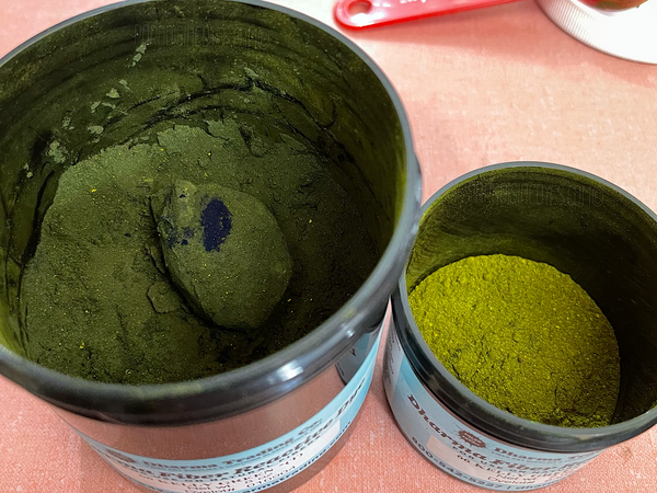
Everything seemed fine and dandy with my new container of Kelly Green, that is, until one day I mindlessly dug my measuring spoon in deep down for no apparent reason, and to my surprise hit what felt like literal cement.

In disbelief, I excavated all of the loose powder out from around this mysterious martian-like mass to reveal a monstrous, rock solid chunk of blue dye powder pigment (turquoise, I assume? idk). Whatever it is, it weighed a whopping 8 grams!
Luckily that’s far from any significant percentage of the overall product weight, but enough that I’m merely curious as to just how much it may or may not alter the resulting Kelly Green shade from what it’s intended to produce.
(UPDATE - I found a second giant blue, hardened dye mass a bit further down in this same jar a short time after originally publishing this blog)

I’ve yet to decide whether I’ll pulverize the specimen back into powder and sprinkle it back amongst the Kelly Green it originated from, or keep it separate and attempt to utilize it solo just for fun.

A second oddity discovered while creating my dye color collection catalogue of swatches was just how indecipherable Brilliant Blue & Lapis apparently are...?So much so, I was convinced I’d mistakenly made samples the same one, just labeled two different names - and thus re-made the sample squares of both colors multiple times. But sure enough, I cannot tell any discernible difference between the two. Like, At. All.
I have a hunch that each color may very well produce a distinctly different toned bleed at the edges, something especially noticeable when ice dyeing. I plan on testing this theory out very soon and will update with my findings.
Regardless, I simply find it fascinating that two colors not even close to one another on Dharma’s color coordinated menu, could be so damn similar — So I’ve been kicking myself in the @$$ for not having prior, past formula versions of either color on hand to compare these reformulated versions to; in order to conclude whether Brilliant Blue & Lapis being identical twins has always been the case or not. The world may never know...
January 18, 2022
Revealing my first impressions, initial thoughts and overall opinion on the brand NEW Dharma Trading Co. Fiber Reactive Dye color thats available now: Magenta Galactica!
Exclusively in this blog post is: a detailed, in-depth review accompanied by an abundance of demonstrative images, true-to-color swatches of Magenta Galactica sampled on 100% cotton — featuring both tie-dyed and ice-dyed examples + much, much more!
January 11, 2022
December 30, 2021
Welcome to the online oasis of one-of-a-kind, hand-dyed, wearable art designs! Paradisiac Dyes is a (Detroit area) Michigan based, one-person-operation that originally got its start on Etsy. This is truly as small as small business gets!
Shipping info | Returns & Refunds | Privacy policy | CCPA opt-out
© 2025 Paradisiac Psychedelic Tie Dye Shop.
All images, graphics, videos & other forms of digital media featured on paradisiacdyes.com and our related social media accounts, including: graphics, images, logos, as well as all written text and slogans, are copyrighted intellectual property of Paradisiac Psychedelic Handmade Goods. All photography, including product page images of individual tie-dye items and other marketing content imagery, always features our own, actual, hand-dyed designs only. All images are as true-to-color as is possible, in an attempt to depict the same shades and tones as they appear in real life. However, visual appearance of colors and tones may be slightly altered on different devices and screens.
